The Employment Agreements module of our Employers Toolbox have had a makeover.
The content of the Agreements have not changed, and there is the same comprehensive functionality which has been streamlined to save you time.
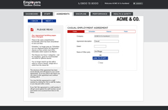
Schedule 1 no longer pops up. Schedules are now displayed before the agreement clauses as they contain most of the information which needs to be filled in.
Schedule 1 (Personal Terms) is the primary place in which the majority of the editing takes place. This screen is the same as before, just first in the order.

Click to zoom
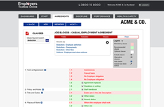
The 'clauses' screen follows the schedules. This screen has several changes.
It has been simplified, clauses coloured, widened and uses a larger font. Clauses remain listed and grouped in the same way as before, ie the order of the Agreement, but can be re-ordered as before. Users can still add their own clauses or clause groups in the same way also.

Click to zoom
To include or exclude clauses to the Agreement now happens by simply clicking the tickbox in the list. You no longer have to open each clause to do this.
The coloured icons to indicate a mandatory or recommended clause has been removed, the whole clause row is now coloured to indicate the same. There is also optional clauses which are white in colour and by default will not be included unless you tick them. A legend on the screen explains the colours and icons.
Searching for clauses has also been simplified. Search results now appear on the clause screen and the results will remain visible unless the user clicks the 'x' to close them or moves away from the clause screen.
Clauses are edited in much the same way - click on the clause to open it.
These functionality changes have been developed following suggestions and comments from our clients and we remain committed to continual improvement of our services based on your feedback. Thank you to all clients whose efforts allow us to better our systems and service.